

Tim Burton’s style is unmistakable. As one of the visionary directors of his time who loves his macabre and morose, his signature interpretations are easily recognised by fans and non-fans alike. His artistic choices affect anything from the costume to the sets, but what he is all about, is the mood. Creating that intrinsic Burton “feel” is a matter not only achieved visually, but through the score and palette he decides as well. With Dumbo, we see him at his brightest yet. Will it go down well with the audience? Only time will tell when the movie opens on 28 March.
In the meantime, fans can quell that nostalgia, by taking a look at our list of Burton’s work, ranked from darkest to lightest.

Sleepy Hollow is so sapped of hues, you might be forgiven for thinking this film was in black and white. But it works wonderfully for this dark, horrific tale of a village hounded by a bloodthirsty apparition, who decapitates someone every time he rides.
Swathed in fog, shadows and silhouettes, the film is mostly made up of blacks, blues and greys, and only occasionally relieved when a flame appears. Even the flesh tones of the characters have been drained to an unnerving pallor, which keeps this spooky tale disturbing even when the spectre isn’t at work. But playing with the stark shapes of gnarly trees and the fearsome horseman himself, the effect is one that impresses the terror upon us, and apparently the Academy as well. The film won an award for Best Art Direction.
Batman Returns

Injecting his brand of darkness to Batman changed the trajectory of the franchise forever. The reception to a gritty superhero has altered the perspective so much so that studios today still aim for that dangerous tone of realism.
But Batman Returns remains untouched as that perfect balance between a hypnotic dark piece and a campy appeal that harkens back to the original comics. While Burton keeps the same dark hues of blues and blacks, he introduces levity through the Penguin’s circus/polar choice of red and white, along with a giant yellow rubber ducky, and adjusts Michelle Pfeiffer’s original candy pink to a dangerous red when she appears. The threesome perfectly adjusts the film’s tone and makes this an iconic title.
Edward Scissorhands

The 1990 dark romance is really the classic Frankenstein reworked with more whimsy. Regarded by Burton himself to be his favourite work, the imaginative tale centres around a re-animated person with scissors for hands. While this no doubt sounds like the stuff of nightmares, Edward is really just looking for a genuine connection.
To juxtapose the difference between the people and Edward, Burton paints the town citizens overtly colourful, and yet with a strange sort of muddiness that hints at a hidden, corrupt nature. This introduction of hues contrasts vividly with Edward and his mansion, both keyed down to the standard monochromatic to emphasise his inability to truly fit in. But hope comes in his love interest, played by Winona Ryder, who ends the show in a white gown to signify her own transition to what is “human” - making a clear statement about how we sometimes fall for surface attraction.
Beetlejuice

Say his name three times and he appears. Beetlejuice is a cult classic and may even return to charm us once again with a sequel in the works. Burton created this zany comedy horror in 1988, and while it is obviously a dark piece, it is relieved by the saturated colours that add a carnival sense of fun to the whole adventure.
As two ghosts try to scare away the new owners of their house, the wacky antics are richly painted in purples instead of the usual blues. It lends an air of the otherworldly, and keeps the palette is often paired with other intense hues to match the intensity of the antics. From slime bug neon green to hellish reds and oranges, the journey is a funhouse ride that you will never forget.

While a lesser-known title, Big Eyes is a 2014 production that is about as “normal” as Burton can get. Featuring a more regulated palette that nonetheless was crafted to match the story circumstances, the film brings the colourful pastel works of Margaret Keane to the fore. In some scenes, the paintings seem dull compared to their environment, mostly when they were not yet popular. But soon they take on a richness when demand soars.
While colour is ever present, the magnetic quality of the big liquid eyes seem to provide a murky anchor, preventing the story from getting flighty, and keeping us reminded about Margaret’s inner turmoil and expression. It’s a true story, given that delightful twist by an admiring fan of her work.
Alice in Wonderland

The collaboration with Disney meant this 2010 production had quite the budget to work with. And Burton was more than happy to unleash his artbox for this classic tale by Carroll.
The Wonderland tale marks Alice’s journey to another world by a rabbit hole, and Burton delineates the two worlds with striking palette differences. The real world seems pleasant in pastels at first, but after the vivid, colourful trip through the mind-boggling alternate dimension, it feels more empty than enviable.
With a high contrast and stark colour combinations (check out that blue eye shadow against the red queen’s flaming hair), it creates the mood for one to receive the unexpected, as Alice did.
Charlie and the Chocolate Factory
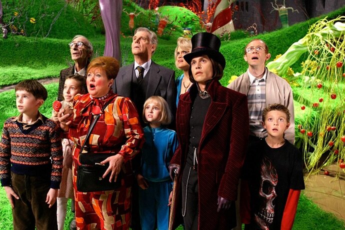
During that same year in 2005, when Burton made Corpse Bride, it seemed like he wanted to compensate the monochromatic animated film with Charlie and the Chocolate Factory. Yes, the film opens up grim and dreary, but we know that Willy Wonka’s world will be thrust upon us with wild abandon.
And what a plunge. From the moment the doors opened to the factory, the colours poured forth like a rainbow. Not only was saturation turned up to an all-time high for Burton, but the glossiness from candy shells and metallic sheen from machines added another dimension. It’s a trippy tour for five lucky kids, but for the only one who got the method in the madness - Charlie - he was appropriately kept grounded with his earth tones.
Dumbo
And of course, we have the upcoming Dumbo.
It is one of Burton’s cheeriest palette yet, not surprising given the circus setting. Bathed in golden sunlight or the glow of the stage lights, the movie departs from the heavy shadows that Burton often prefers. The choice of the warmer hues fits this story, especially because of the very tender topics of relationships and loss, but also because it reminds us that hope is never far away.
It reminds us of one of his earlier works, Big Fish, which also features a circus, but Dumbo’s softer treatment and brightness will ensure fans still receive an updated Burton experience.


